

BeCore
Services: User Experience and User Interface Design
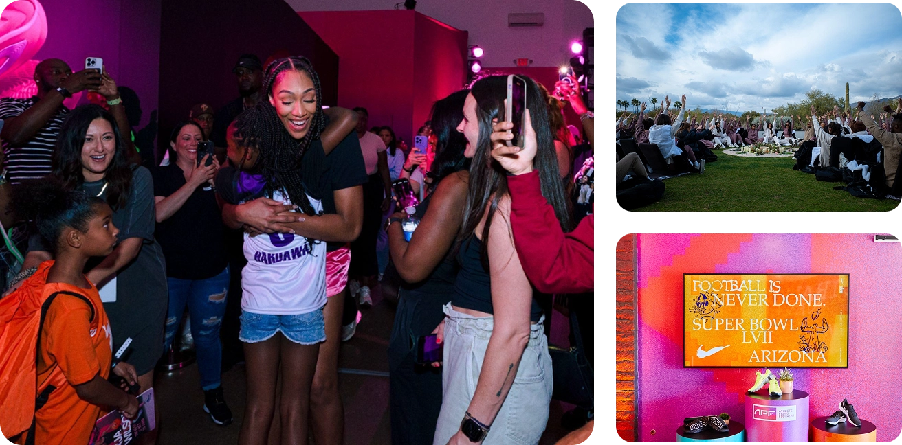
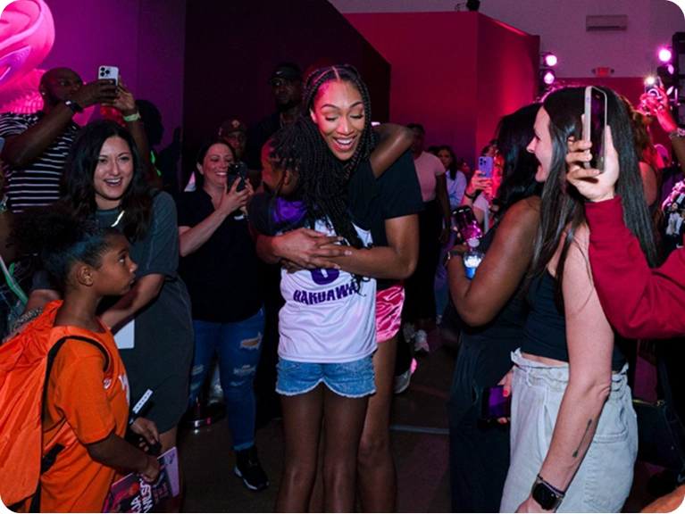
BeCore is an experiential marketing agency specializing in large-scale brand activations and live events. While the agency excelled at creating compelling narratives in real life, its website prioritized search engine optimization at the expense of a clear, engaging experience for human viewers. As a result, potential clients weren’t getting an accurate picture of BeCore’s creative range, strategic thinking, or the impact of their work.
The goal was to create a web experience that translated the excitement of in-person events into a clear, conversion-focused digital journey—balancing expressive visuals with usability, clarity, and scalability. As the UX/UI Designer, I restructured the site architecture and redesigned the interface to better tell BeCore’s story, showcase their work, and guide users toward meaningful engagement.
Setting the Guest List
BeCore’s primary users were prospective clients. They needed to quickly understand BeCore’s capabilities, creative approach, and the scale of work they could deliver.
For users, the site needed to answer three core questions: What does BeCore do? How do they do it? And, why should I trust to represent my brand on the public stage? From a business standpoint, the goal was to increase qualified inquiries by clearly communicating value, establishing credibility, and guiding users toward contact without overwhelming them.
To meet the needs of the users and our clients, we’d balance expressive storytelling with clarity and structure to create a path that felt engaging while supporting confident decision-making.
Building a Narrative Arc
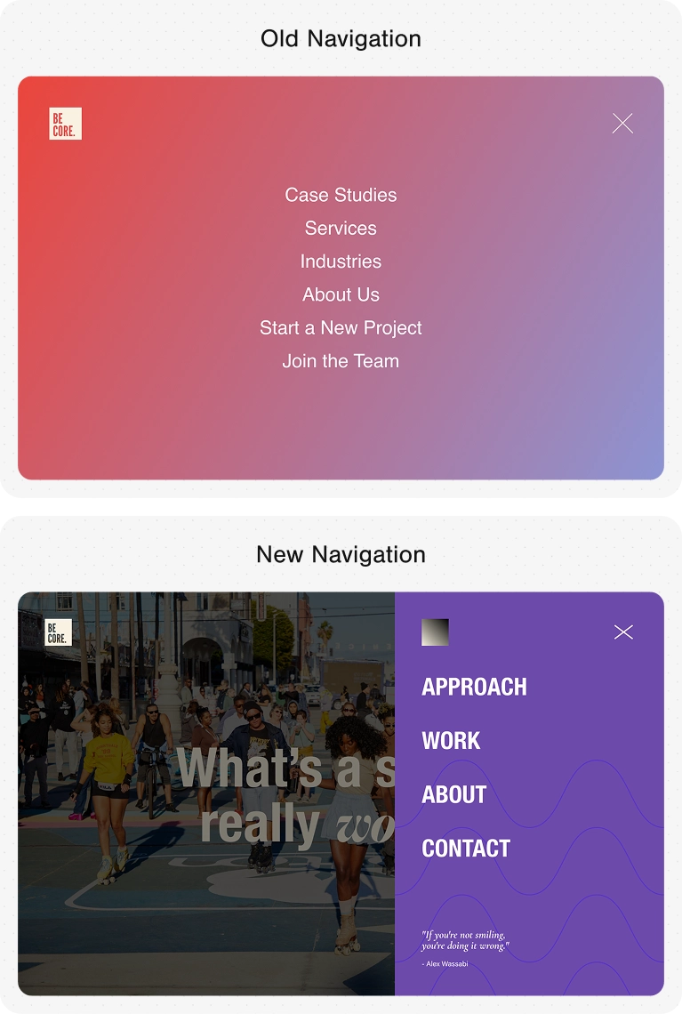
Information Architecture
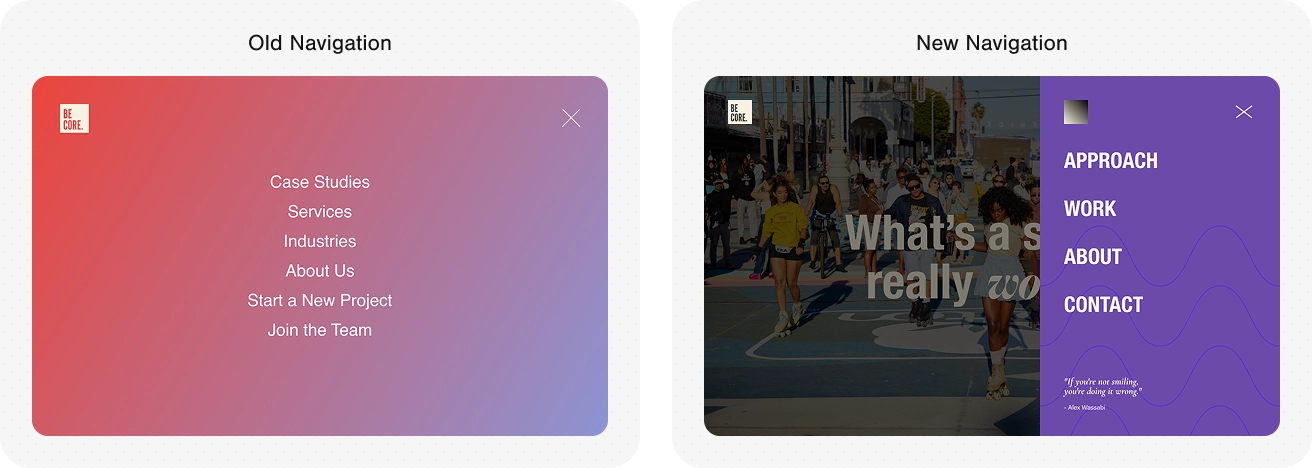
The original site treated case studies, services, and industries as equal entry points, which diluted the narrative and made it harder for new visitors to quickly grasp BeCore’s strengths. The business thrives on quality over quantity, and prioritizing long-tail keywords over converting was not serving them. Rather than clarifying value, the structure asked users to self-orient before they had enough context to do so.
This approach was validated with three pieces of research:
• A competitive analysis revealed that top-end competitors did not have matching sections.
• In interviews with potential users, pages listing types of work were seen as less persuasive than in-context demonstrations of capability.
• Google Analytics showed lower conversion rates from the industry and service oriented traffic.
To simplify the experience, I restructured the site around case studies. Allowing the work to speak for itself created a more focused narrative flow and shifted emphasis toward BeCore’s philosophy and creative approach, an attribute stakeholders identified as a key differentiator. This shift reduced cognitive load and clarified positioning.
User Experience & Interface Design
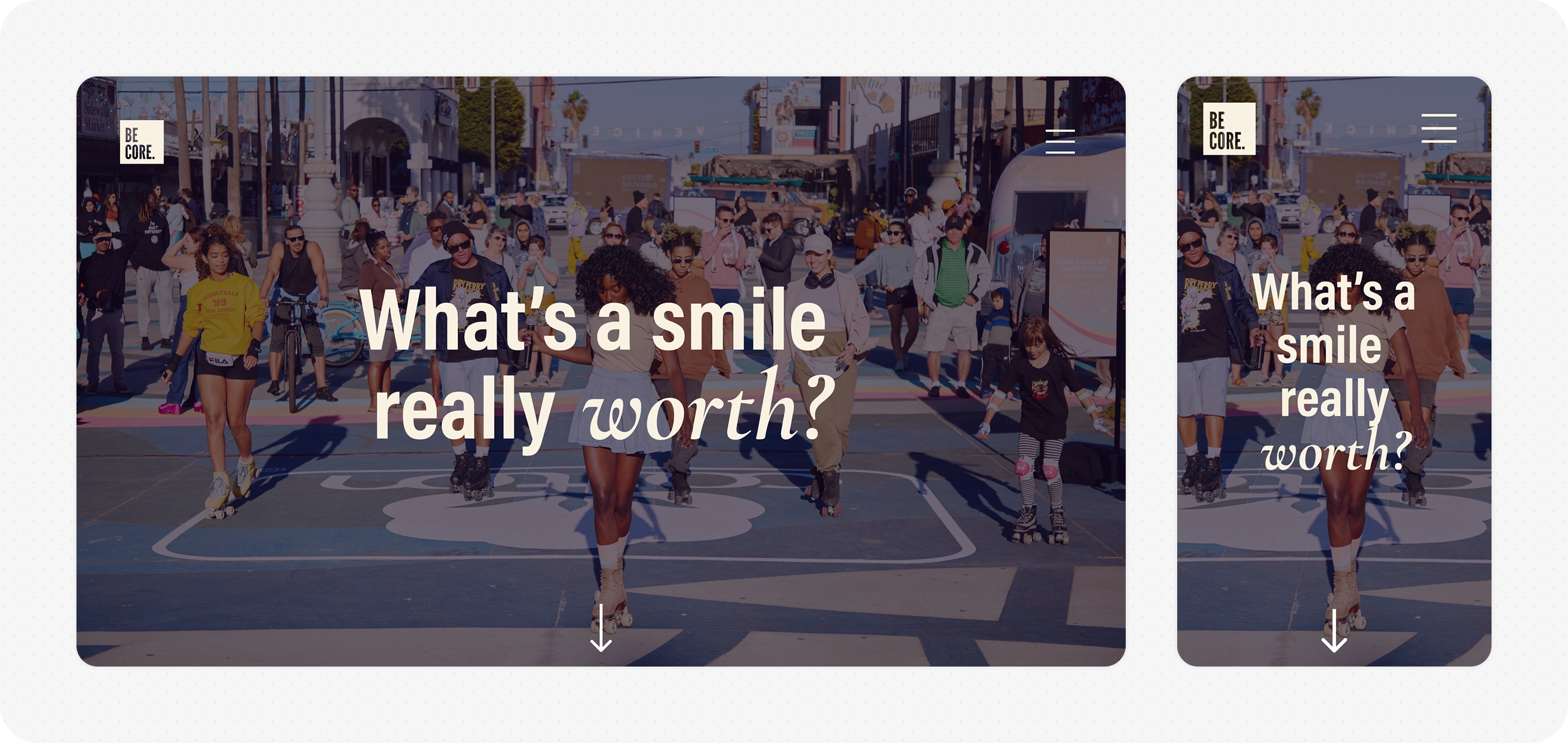
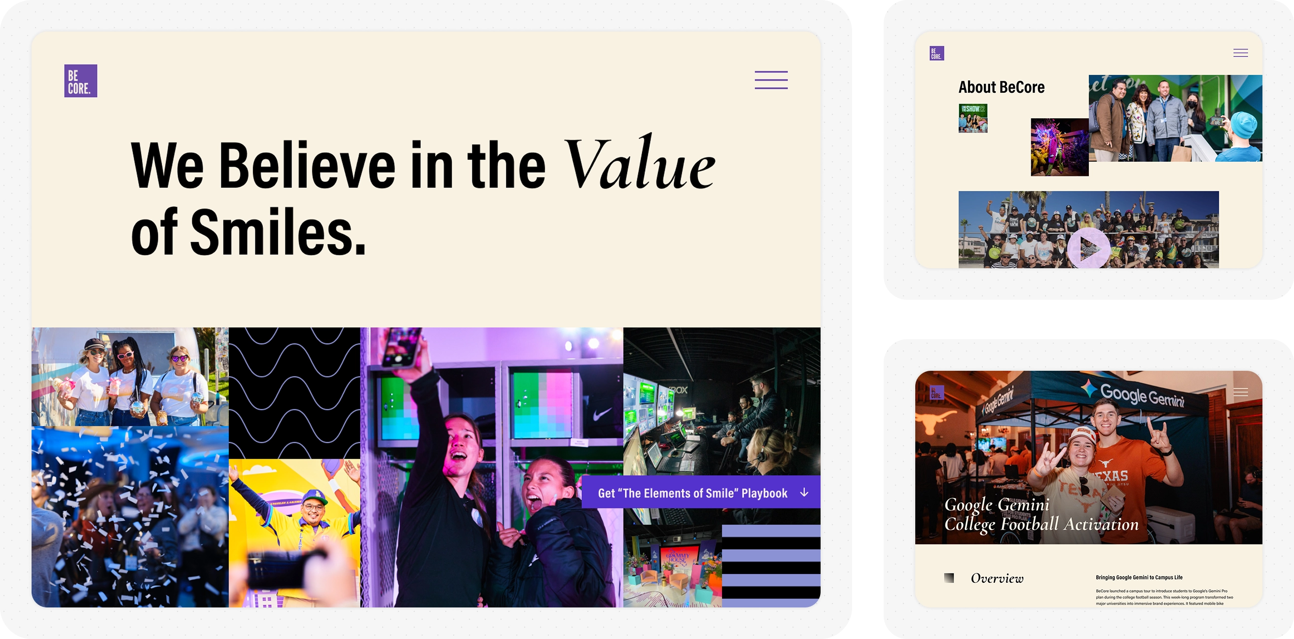
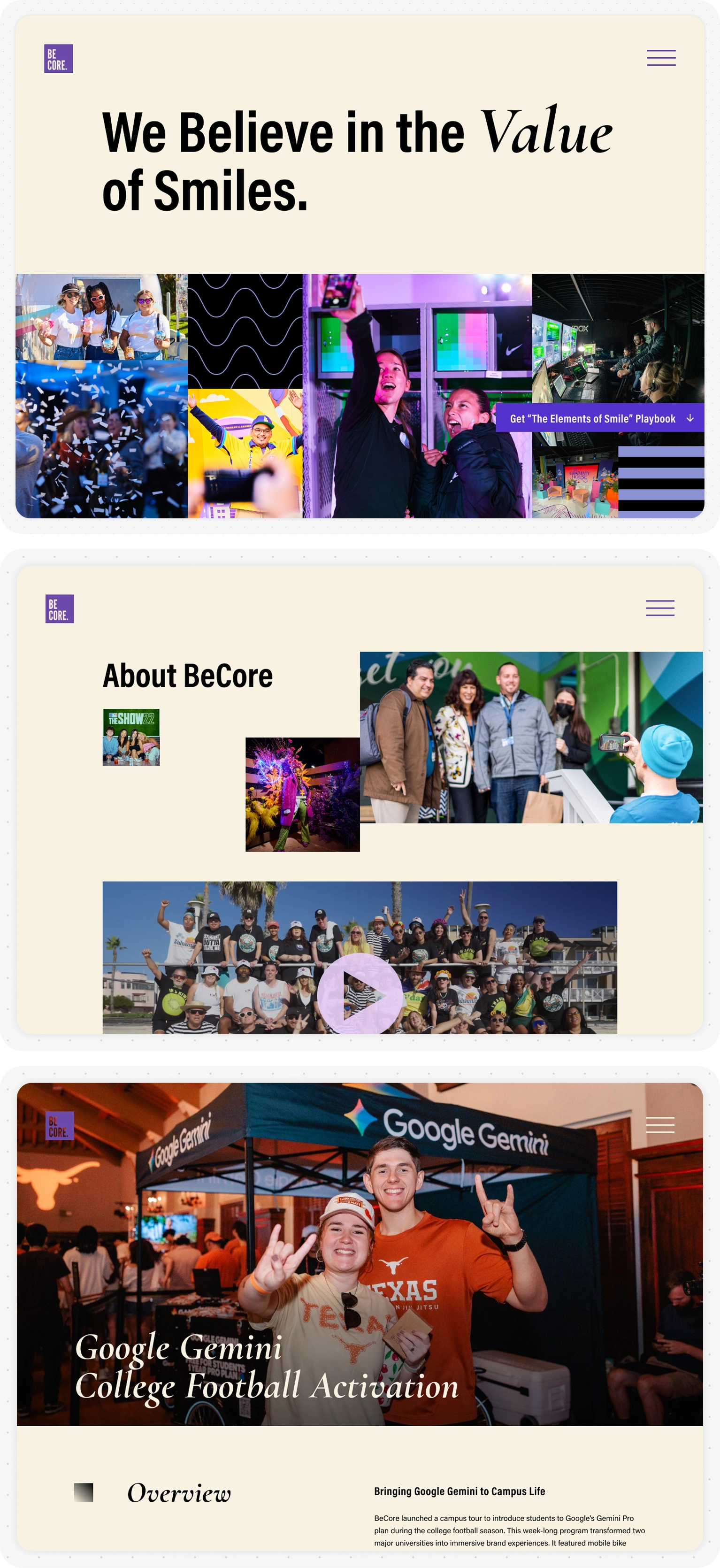
The primary creative direction centered on expressing the “power of smiles” for brands: capturing the energy, optimism, and emotional impact of BeCore’s live experiences. Brand guidelines emphasized flat, gridded space, energetic patterns, and large, engaging visuals.
To translate these expressive elements into a usable, scalable web interface, I focused on creating strong visual hierarchy, intentional pacing, and clear interaction patterns so that expressive moments supported the narrative rather than overwhelming it.
I codified these into a web style guide with defined usage rules and reusable components. This system allowed the design to scale across pages and content types while maintaining visual cohesion and supporting efficient iteration as the site evolved.
After the Party
The redesigned site launched successfully and was well received by BeCore’s stakeholders, who felt it more accurately reflected the energy, philosophy, and scope of their work. The success of the project led to an ongoing engagement, during which I continued to expand the site with new content sections as business needs evolved. From a design perspective, this project reinforced the value of letting strong work speak for itself.
See the Live SiteMore Case Studies
Corfini
Services: User Experience and User Interface Design
Helping a storied butcher prove their experience to a modern audience
VIEW THE PROJECT
MasonHub
Services: User Experience and User Interface Design
Working with a third-party logistics provider to unpack the complexities of their industry
VIEW THE PROJECT