

MasonHub
Services: User Experience and User Interface Design
MasonHub is a third-party logistics (3PL) provider offering warehousing, fulfillment, and supply chain services for growing brands. While their capabilities were robust, the existing website struggled to connect with target industries by clearly showing how MasonHub’s services mapped to specific client needs.
Services were presented in isolation, without sufficient context around why different audiences might need them. As a result, prospective clients were required to interpret unfamiliar logistics terminology on their own, making it difficult to see how MasonHub’s offering was tailored to their business.
I was brought on as a UX/UI Designer to clarify MasonHub’s value proposition by restructuring information, simplifying language, and designing an experience that made complex services feel approachable and actionable.
Packaging Complex Services
MasonHub’s primary users were decision-makers at fashion, beauty, and wellness brands evaluating third-party logistics partners to support warehousing and fulfillment needs. These users were not only comparing operational capabilities, but also assessing whether a logistics provider could uphold the quality and brand experience their customers expected.
For these prospective clients, the site needed to clearly communicate how MasonHub’s services aligned with their industry-specific challenges and standards, without requiring deep familiarity with logistics terminology.
Secondarily, the site served as a tool for MasonHub’s internal sales team, who relied on it to provide prospective clients with clear, take-home information that reinforced conversations and supported follow-up.
From a business perspective, the goal was to improve lead quality by helping the right clients quickly recognize MasonHub as a strong fit.
Unboxing Third-Party Logistics
Interviews & Information Architecture
To better understand both business priorities and client expectations, I conducted interviews with MasonHub’s founder and CEO, the head of sales, and members of the inside sales team.
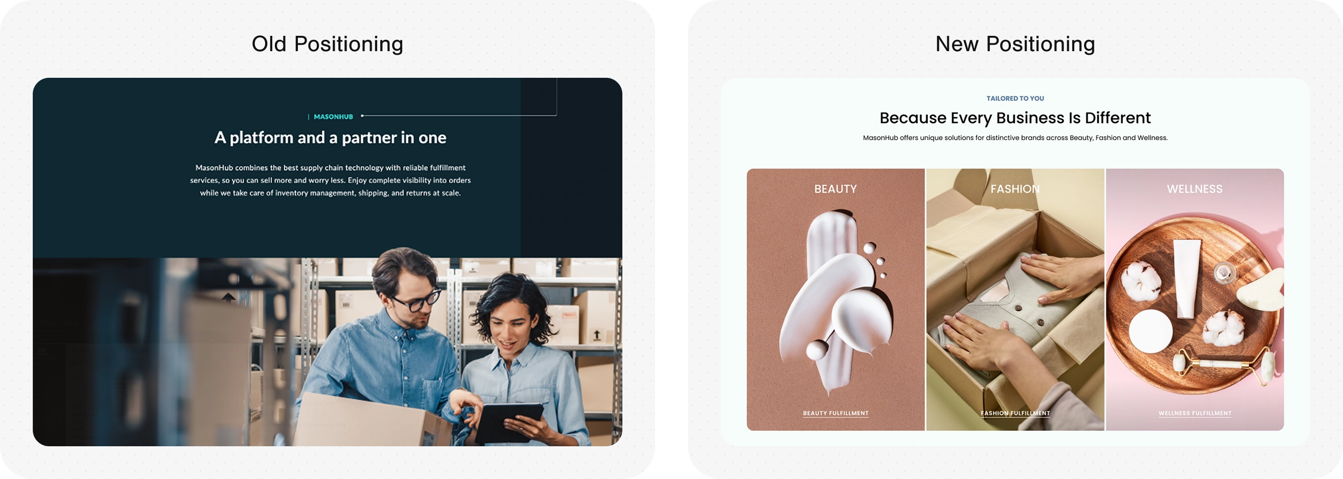
These conversations revealed that while MasonHub served a range of industries, fashion, beauty, and wellness brands each had distinct operational needs—particularly around kitting and packaging, inventory rotation for expiration-sensitive products, and environmental considerations such as temperature and moisture control. Some of this information existed on their site, but it wasn’t prioritized or contextualized to help clients understand how MasonHub’s capabilities aligned with their specific industry requirements.
Based on these insights, I restructured the site’s information architecture to foreground industry-relevant use cases and translate technical logistics services into clearer, audience-specific value. This allowed users to quickly see themselves in the offering and understand how MasonHub could support their unique operational challenges.
User Experience, Interface Design & Branding
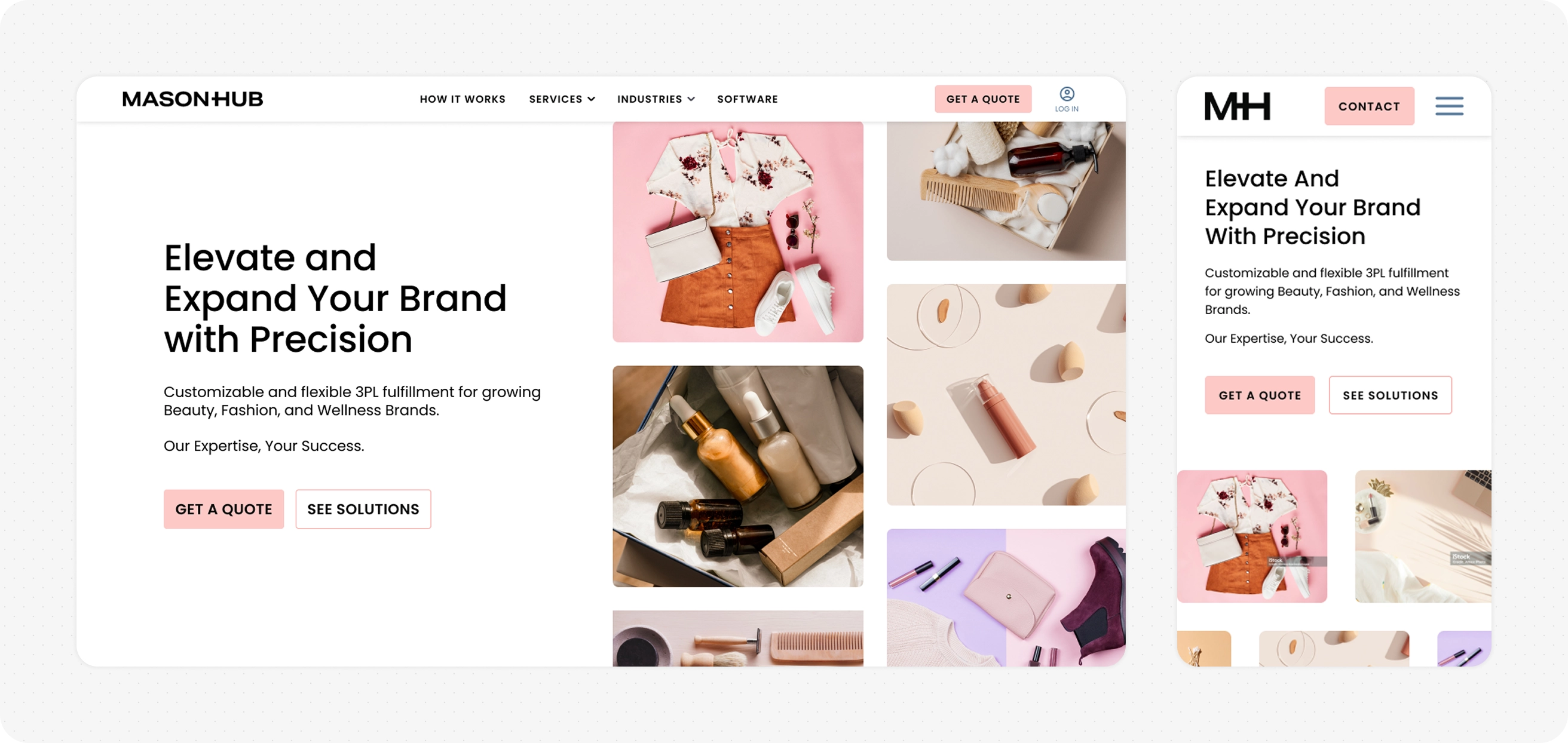
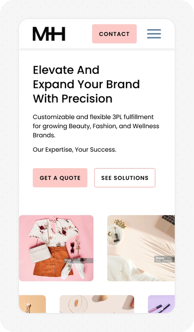
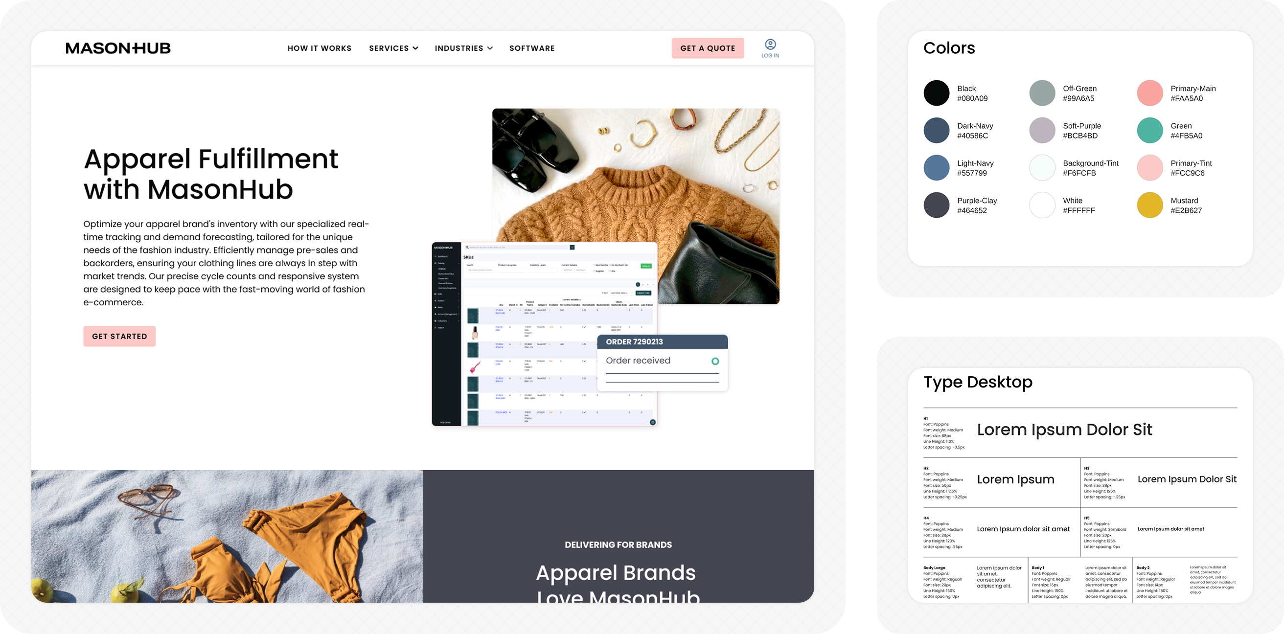
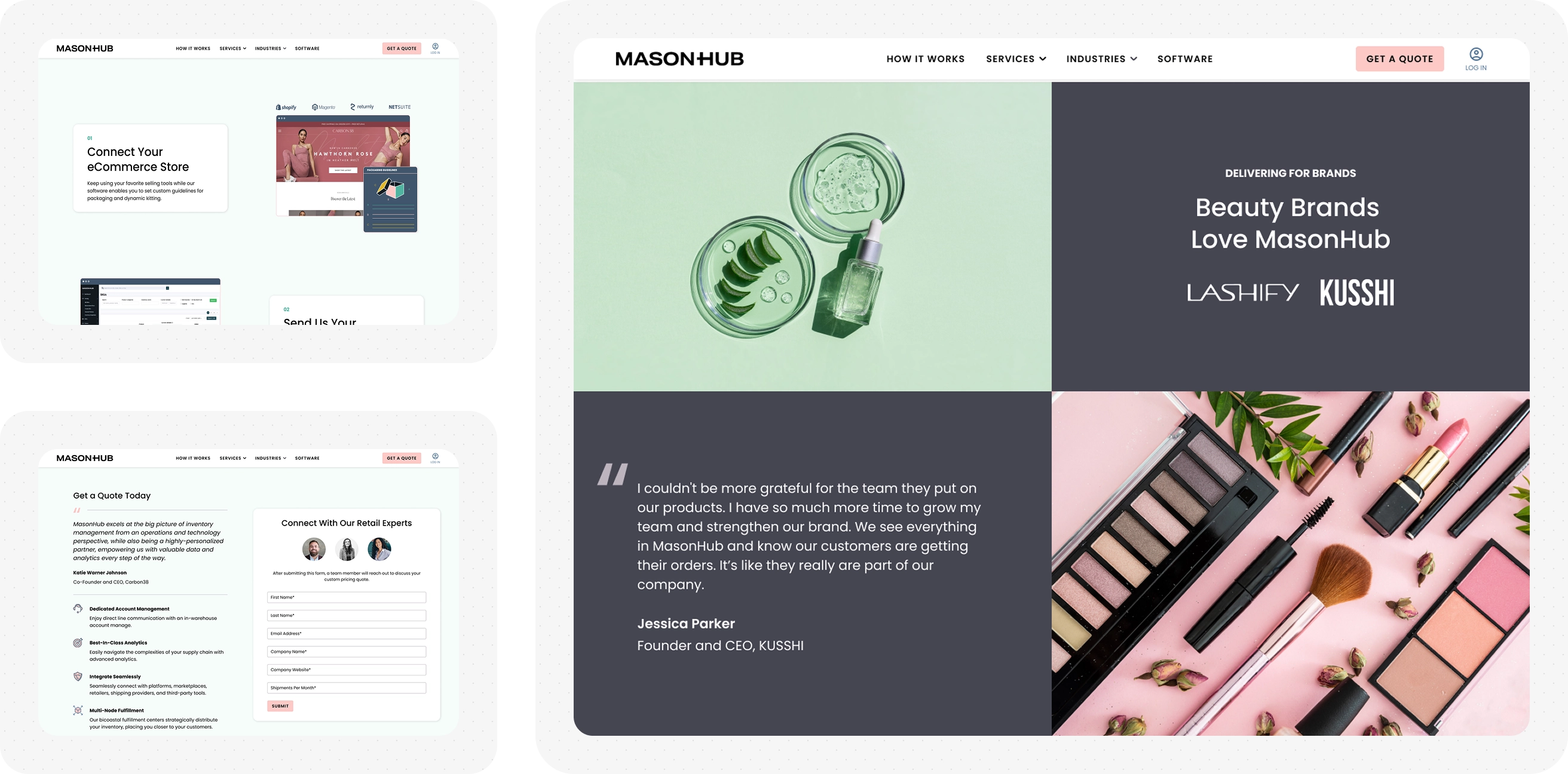
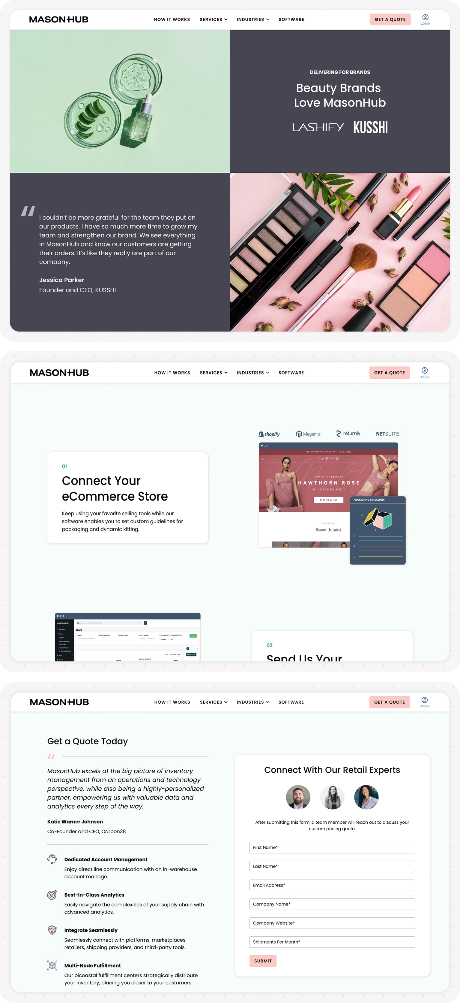
The interface was designed to make MasonHub’s industry focus immediately legible while maintaining a cohesive overall experience. To support different audiences, I updated site imagery to show the end consumers of MasonHub’s clients, helping prospective brands see how fulfillment and logistics connected to their own customer experience.
Structurally, I introduced an industry-focused menu in the primary navigation, clearly calling out fashion, beauty, and wellness. Each item linked to a dedicated landing page that contextualized MasonHub’s services around the specific needs of that industry, reducing ambiguity and allowing users to self-identify quickly.
Visually, the brand was refined to feel more aligned with the expectations of fashion-forward and consumer-facing brands. I shifted the color system to a clean white base with restrained pastel accents to add warmth and approachability without sacrificing clarity.
Typography was updated from a soft, rounded sans-serif to a more geometric typeface, reinforcing a sense of precision and professionalism while better resonating with fashion and athletic brands. Together, these changes helped position MasonHub as both operationally capable and brand-aware.
The redesigned site helped MasonHub more clearly communicate its fit for fashion, beauty, and wellness brands by aligning structure, language, and visuals around industry-specific needs. Internally, the updated navigation and landing pages gave the sales team a clearer tool to support conversations and follow-up with prospective clients.
This project reinforced the value of pairing qualitative insight with clear information architecture—using structure and visual systems to turn complex services into relatable, confidence-building experiences.
My work with MasonHub has continued since the launch of the site. To further increase sales conversions, I’ve created landing pages and paid social graphics for the business.
More Case Studies
Corfini
Services: User Experience and User Interface Design
Helping a storied butcher prove their experience to a modern audience
VIEW THE PROJECT
Greenwolf
Services: User Experience and User Interface Design, Branding
Uniting touchpoints of a Los Angeles Cannabis brand for a more cohesive user experience
VIEW THE PROJECT