Case Study
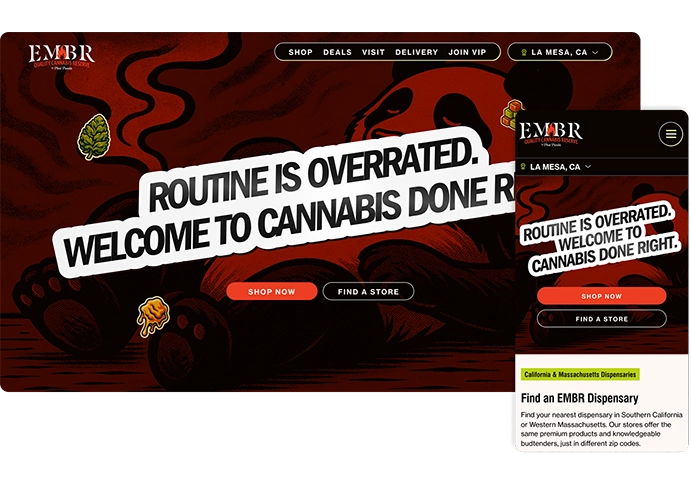
EMBR
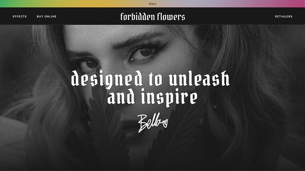
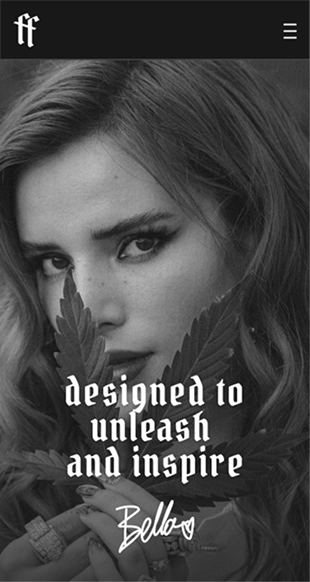
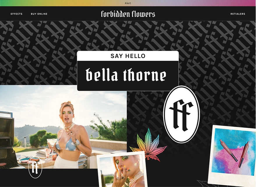
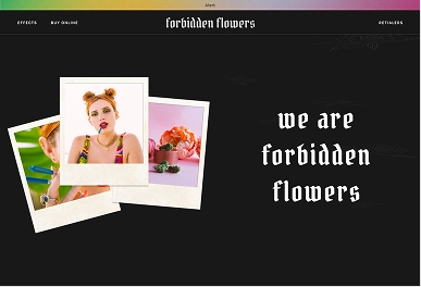
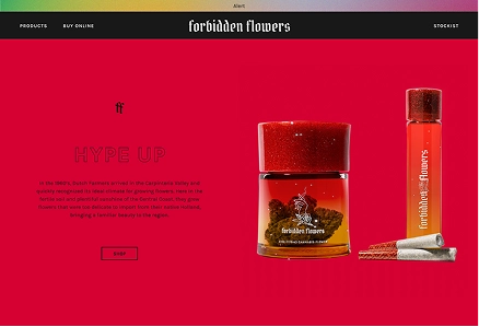
Forbidden Flowers is a cannabis line backed with the star power of Bella Thorne and run by cannabis industry vets Glass House Brands. Forbidden Flowers challenges the stereotypical image of the male slacker cannabis consumer, projecting a strong, energetic, feminine image.
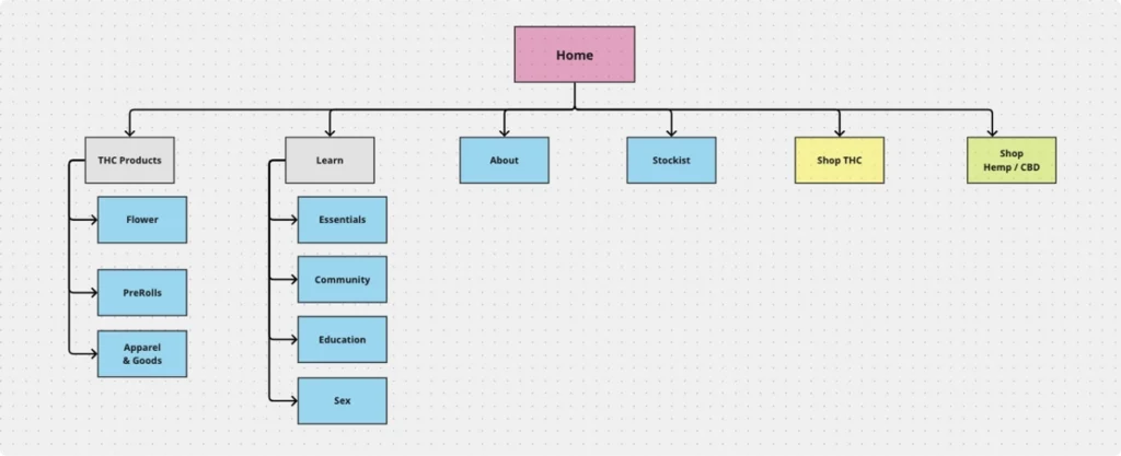
Forbidden Flowers was getting ready to launch a new product line. With the announcement of their new range, they wanted to create a website that would provide a more notable first impression for the brand. The items themselves weren’t the only thing that was new – they were also introducing a system for categorizing them that would need to be taught to the new users.


Our solution for Forbidden Flowers was a visual-heavy site that highlighted the important lifestyle aspects of the brand.
To establish a better understanding of the industry, we started with an analysis of some of the brand’s biggest competitors. We saw a preference from consumers for a clean, modern approach to UI and visual design. This wasn’t always matched as well as it might have been with appropriate lifestyle content.
After reading through further market research, we saw that young, LBGTQ women have historically been underserved in the industry despite using cannabis at higher rates than their peers and their willingness to experiment with a range of products.
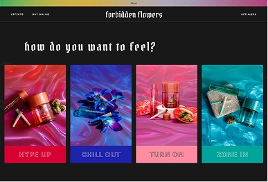
To make a strong first impression with the visual design, we leaned into the brand’s bold color scheme, placing pops on a black background to maximize vibrancy. Along with graphic color blocking, we provided ample space to show off their stylized lifestyle photographs. These were contrasted with big and bold white-on-black typography. Finally, we added motion to bring it to life.
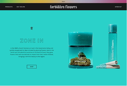
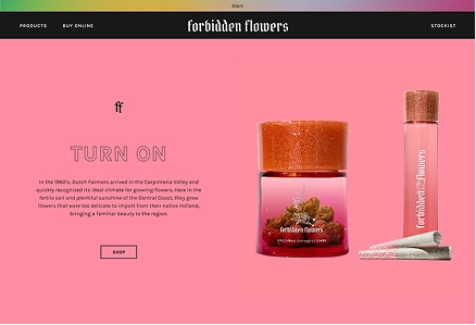
As for the structure, we needed to highlight the effect-centric schema with which the new product line was organized. On the homepage, the effects are displayed prominently and coded to begin to establish color-effect relationship. As a way of providing users with a more interactive, fun way of learning about the labels, we created a quiz where they could find out which one was for them. Along with those strategies, we also created an ‘effx’ page that provided a high-level overview of intended niches for each product.
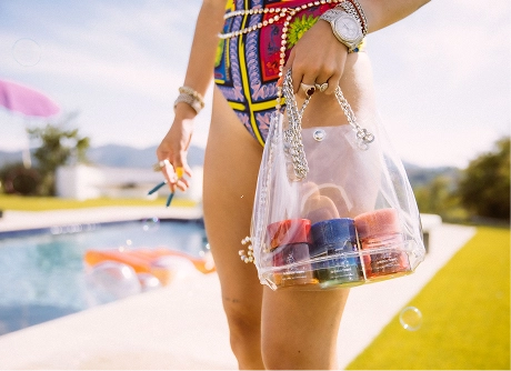
The lifestyle approach was continued on the product pages. Because of the legalities of the cannabis industry, the product pages had to be oriented towards information rather than purchase. We used this in our favor with each product page providing space to highlight the activities that are recommended for pairing with each effect. The pages feel more editorial than sales oriented with a heavy focus on imagery.
FURTHER CASE STUDIES
•FURTHER CASE STUDIES
•FURTHER CASE STUDIES
•FURTHER CASE STUDIES
•FURTHER CASE STUDIES
•FURTHER CASE STUDIES
•