Case Study
BeCore
EMBR is a multi-location cannabis dispensary operating in California and Massachusetts. Their existing website was built primarily to support search engine optimization. While it performed well in discoverability, the experience was text-heavy, repetitive, and difficult to navigate — especially across multiple locations.
The challenge was to balance SEO visibility with a streamlined shopping experience while elevating EMBR’s brand perception. The existing structure treated each retail location equally in the navigation, forcing users to repeatedly sort through options to find the right store and menu. At the same time, platform limitations (Squarespace) constrained flexibility and contributed to a rigid, outdated interface.
As the UX/UI Designer, I reworked the site experience from entry point to navigation, introduced location-based personalization, and modernized EMBR’s visual and UI system to create a scalable, cohesive digital presence.

EMBR’s customers fell into two primary behavioral paths:
Users were successfully reaching the site, demonstrating that the core problem wasn’t discovery. The friction began once they landed. Visitors had to manually scan location lists, navigate redundant menus, and reselect their store multiple times before reaching relevant content.
The primary design objective became clear: help users get to their specific location and menu as quickly as possible, then remove unnecessary friction from that path.


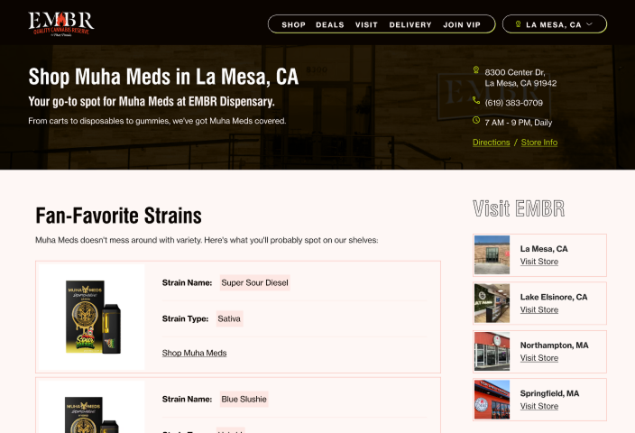
The original navigation structure treated all locations equally. This created cognitive overload and diluted relevance — especially for returning users who consistently shopped at the same store.
To resolve this, I introduced a location selector at the age gate. This decision intentionally added a small amount of friction upfront; however, it unlocked significant downstream benefits:
By capturing location intent early, we transformed the rest of the experience into a guided, contextual journey rather than a broad directory. This shift reduced repetitive decision-making and created a smoother path to purchase.


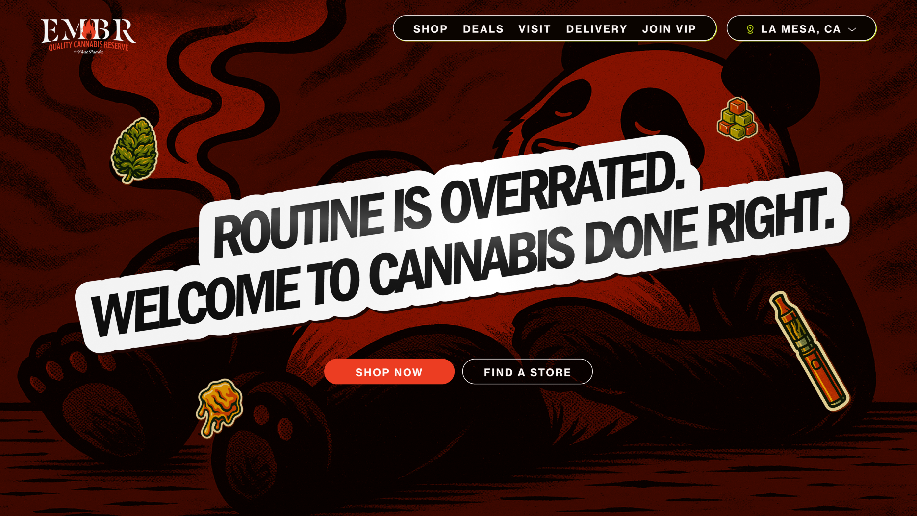
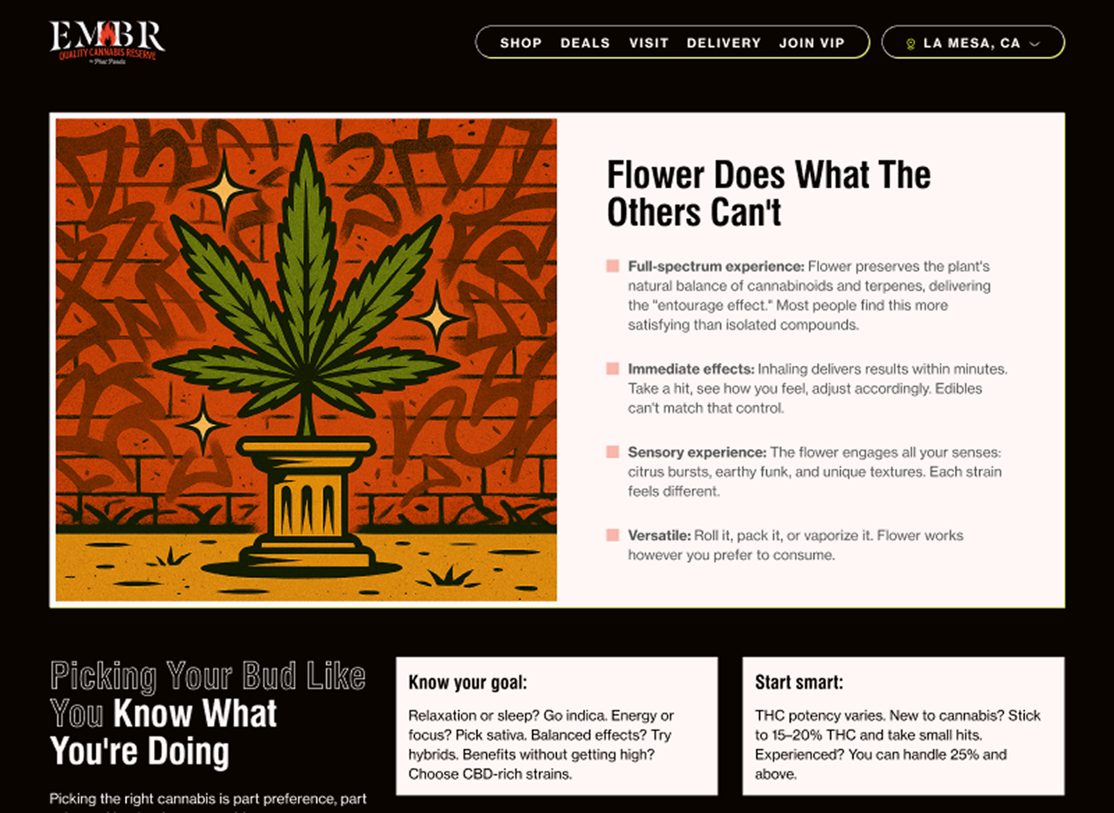
Beyond navigation, EMBR’s digital manifestation didn’t match the intended brand voice. The existing interface relied on rigid cards, dense text blocks, and static layouts that felt disconnected from EMBR’s vibrant in-store presence.
The redesign focused on three core principles:
This system enabled consistency across multiple locations while allowing for flexibility in promotions, content, and seasonal campaigns. The result was a scalable design foundation that supported future iteration.

The redesigned site recently launched, but early indicators show measurable improvement in key friction areas.
By restructuring the architecture and introducing a modular UI system, EMBR now has a digital foundation that supports both growth and brand expression — without sacrificing usability for SEO performance.
FURTHER CASE STUDIES
•FURTHER CASE STUDIES
•FURTHER CASE STUDIES
•FURTHER CASE STUDIES
•FURTHER CASE STUDIES
•FURTHER CASE STUDIES
•