Case Study
EMBR
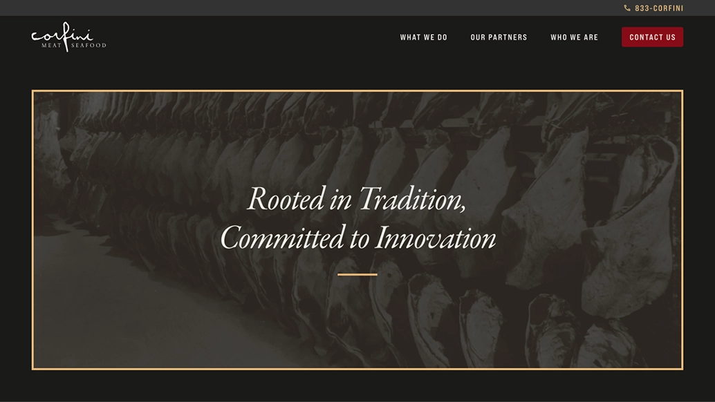
Corfini Gourmet is a gourmet wholesale meat and seafood supplier with over 100 years of quality service. They came to us looking to refresh their website to serve as a resource hub sales people could provide to B2B clients.
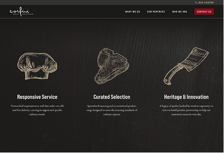
Along with supplementing their sales team’s efforts, the website needed to serve as a calling card and teaching tool that Corfini’s leads could use to advocate within their own businesses. We made sure to highlight their main brand differentiators:
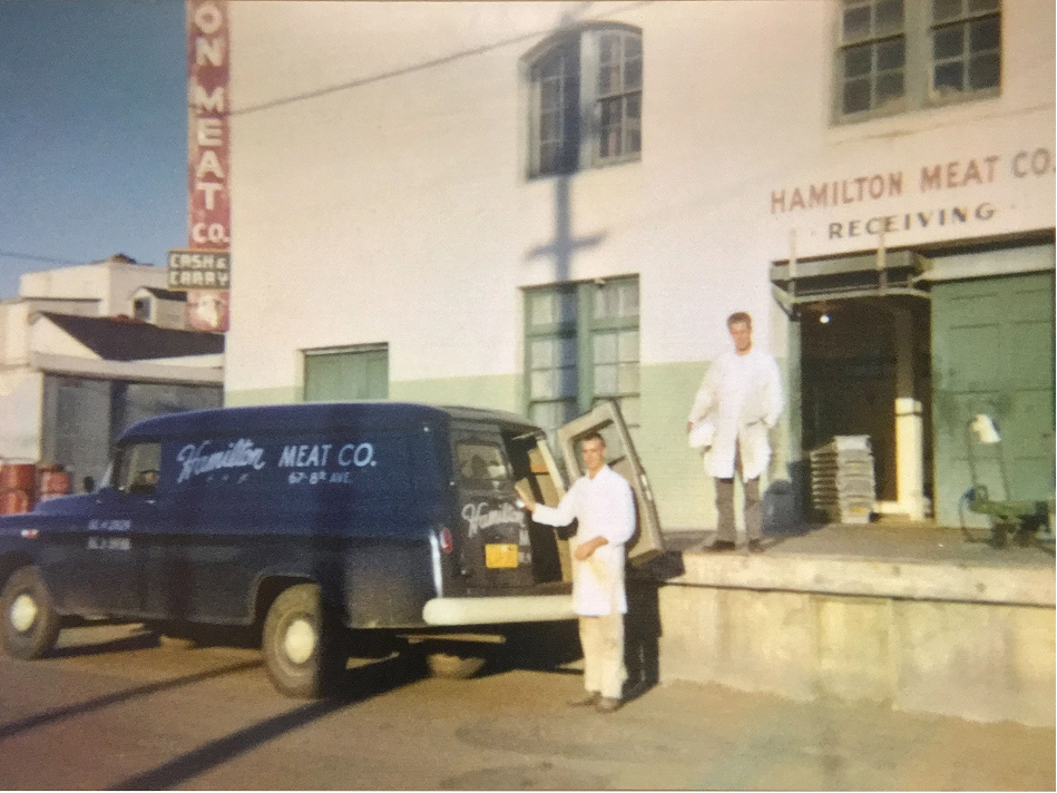
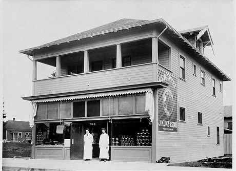
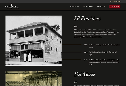
In our initial meetings with Corfini, we sought a better picture of their competitive landscape. Stakeholder interviews revealed that the brand’s history gave it a unique story to tell. Taking a look at their competitors, we saw space to reference the strong visual history of butchery while creating a visual experience that would stand out.
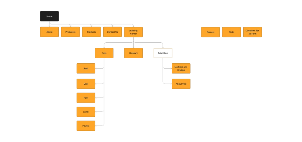


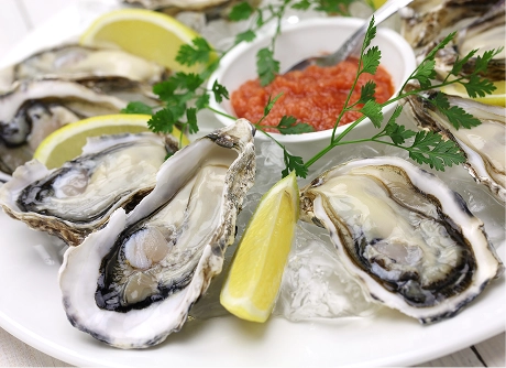
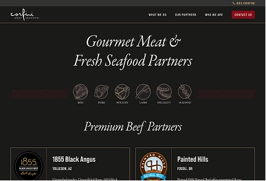
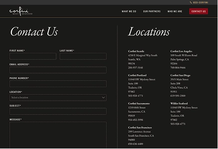
With a basic idea of the story, we started to map out the information hierarchy. Since Corfini doesn’t sell individual products online, we kept the view of their offerings very high level. In equal importance to the types of meat, we made sure to shine a light on the quality of the farms it comes from. Finally, we left plenty of space for Corfini to speak about their history directly.
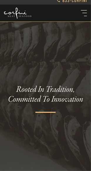
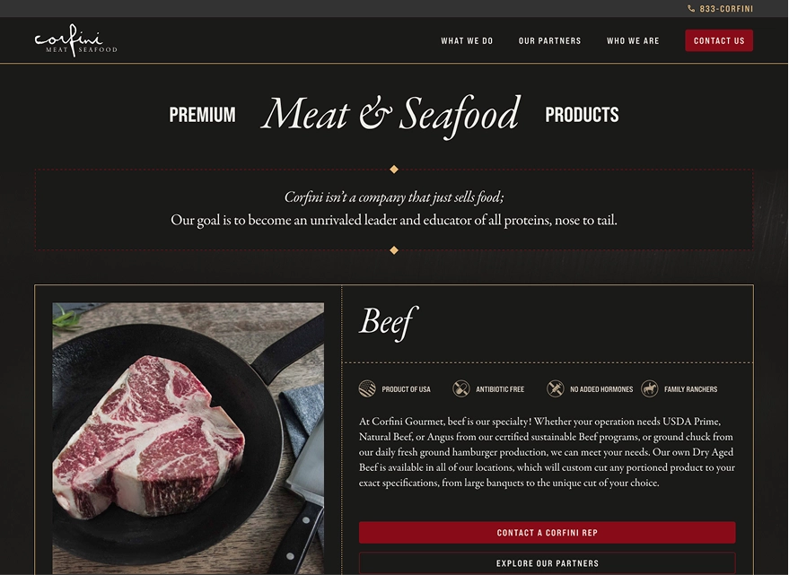
From there, we began to establish a visual style for the site. Corfini was already using Garamond and Bebas Neue for their print materials, but we had room to play with how the type was styled and the color palette. The condensed sans serif and italic headline cut of the Garamond played together nicely and helped reference the range of food history, from neighborhood butchers to fine dining. With the type, we employed a dark set of warm colors meant to evoke the feelings of a steakhouse.
FURTHER CASE STUDIES
•FURTHER CASE STUDIES
•FURTHER CASE STUDIES
•FURTHER CASE STUDIES
•FURTHER CASE STUDIES
•FURTHER CASE STUDIES
•