Case Study
EMBR
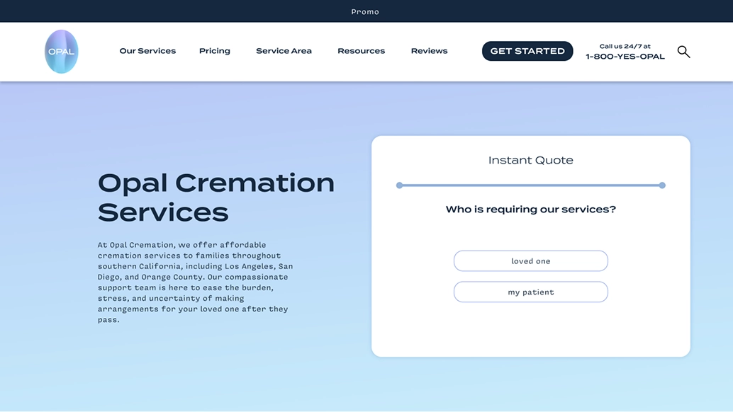
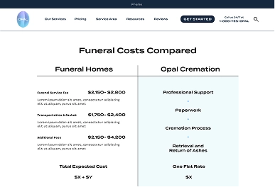
Opal simplifies the cremation process by offering customers direct, all-inclusive packages. In doing this, they’re able to streamline a complex process that people have to navigate at a stressful and sensitive time. It also allows them to keep prices down and remove some of the added burden that is brought on by the death of a loved one.
Our team was tasked with creating a website that would extend Opal’s values of hassle-free ease of use to its digital interface. We needed to consider that some of our users would be slightly older, and not very tech-literate. It was also important to account for users whose attention might be divided, given the grieving mental state or might be pressed for time with the sudden addition of new responsibilities.


To untangle the problem, we began with conversations with the business stakeholders. They were able to provide a sense of the challenges that users faced in the current environment. With a basic framing from them, we explored mindful design patterns so as to be sensitive toward our user’s delicate state. Further, we researched the look and feel of tranquil spaces so as to create a familiar feeling of comfort.
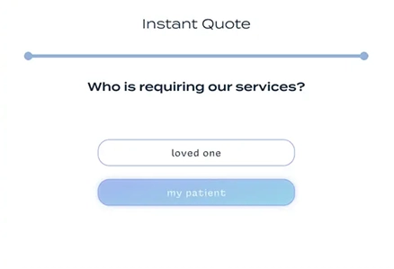
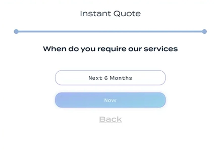
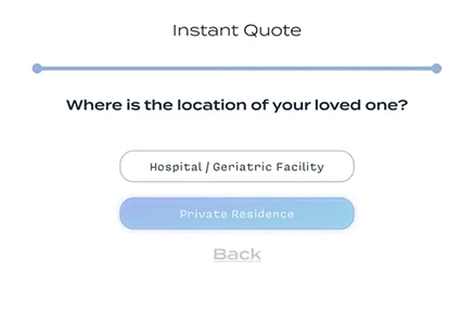
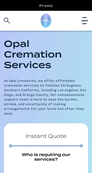
We found that users who were in need of our services didn’t want to be inundated with information. We prioritized welcoming customers into our process. On the homepage, they’re greeted with a straightforward form that helps them get the necessary information across to Opal’s team who can help them through the process with a delicate human touch. To achieve this, the form had to meet a few requirements:
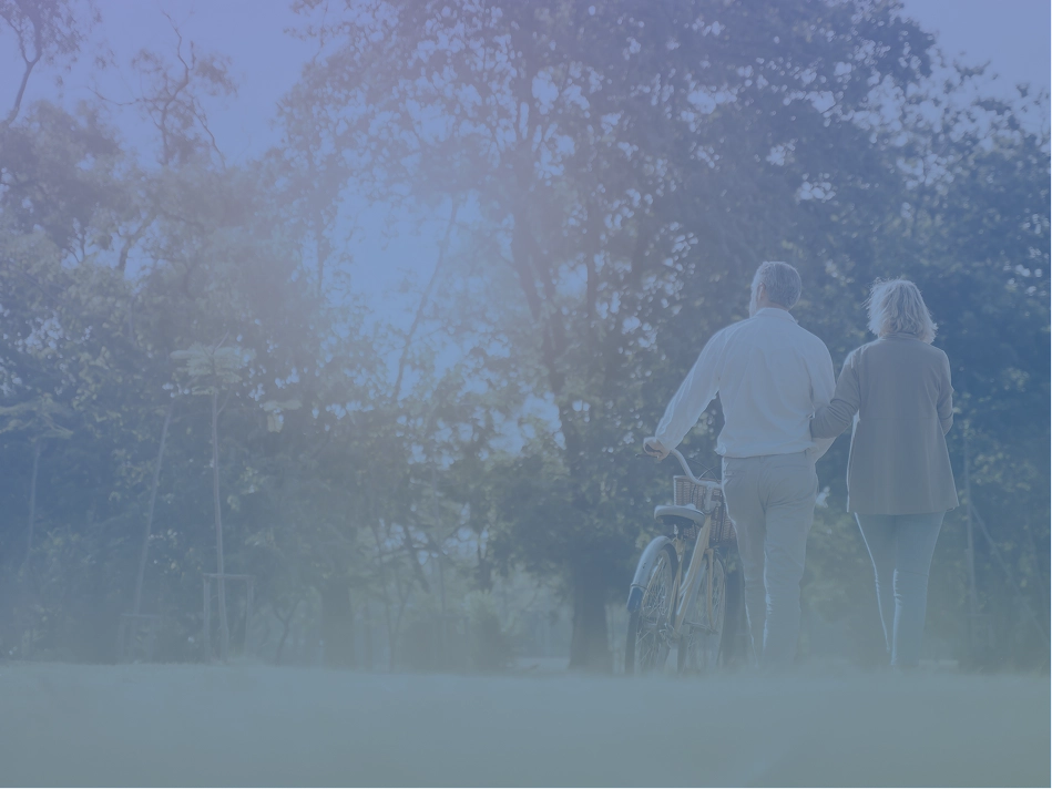
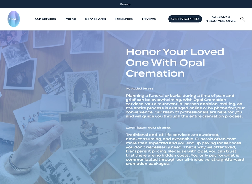
As the UI designer, I was responsible for making sure that the visual design furthered the calming, focused experience. To achieve this, I highlighted Opal’s airy blue and purple brand colors throughout the design. I made heavy use of the washy gradients that could help smooth the experience from one section to another. I echoed the gradients with glowing hover states that would radiate outward from buttons to provide user feedback. I made the buttons are large with soft rounded edges to make them clearly legible and increase the target size. I gave the cards an electric blue border to add some focus and set them off from their gradient backgrounds. I added gradient overlays to the images as well to soften some of the details and help them feel more like they could be pulled from anyone’s life. All of these details come together to give a meditative, focused feel to the site that reinforces the UX work.
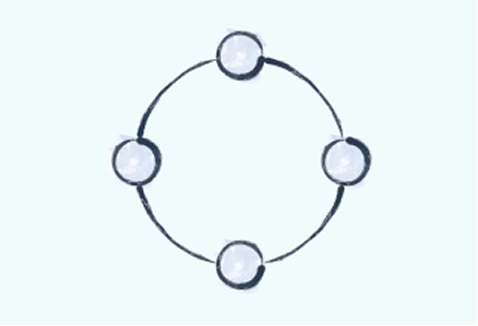
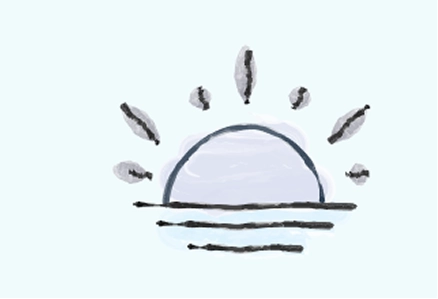
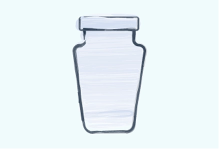
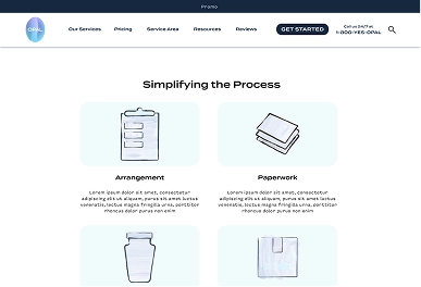
Along with the interface work, I also drew a series of icons to support the site’s messaging. These were created to be simple enough to read quickly, but then given some humanity by rendering them with washy brush strokes in the brand’s blue shades.
FURTHER CASE STUDIES
•FURTHER CASE STUDIES
•FURTHER CASE STUDIES
•FURTHER CASE STUDIES
•FURTHER CASE STUDIES
•FURTHER CASE STUDIES
•